I discovered Authentik, an open-source identity provider that lets me run my own SAML, OAuth, and OIDC stack with a powerful UI. I call it the "Home Assistant" for authentication - free, community-driven, and totally tweakable.
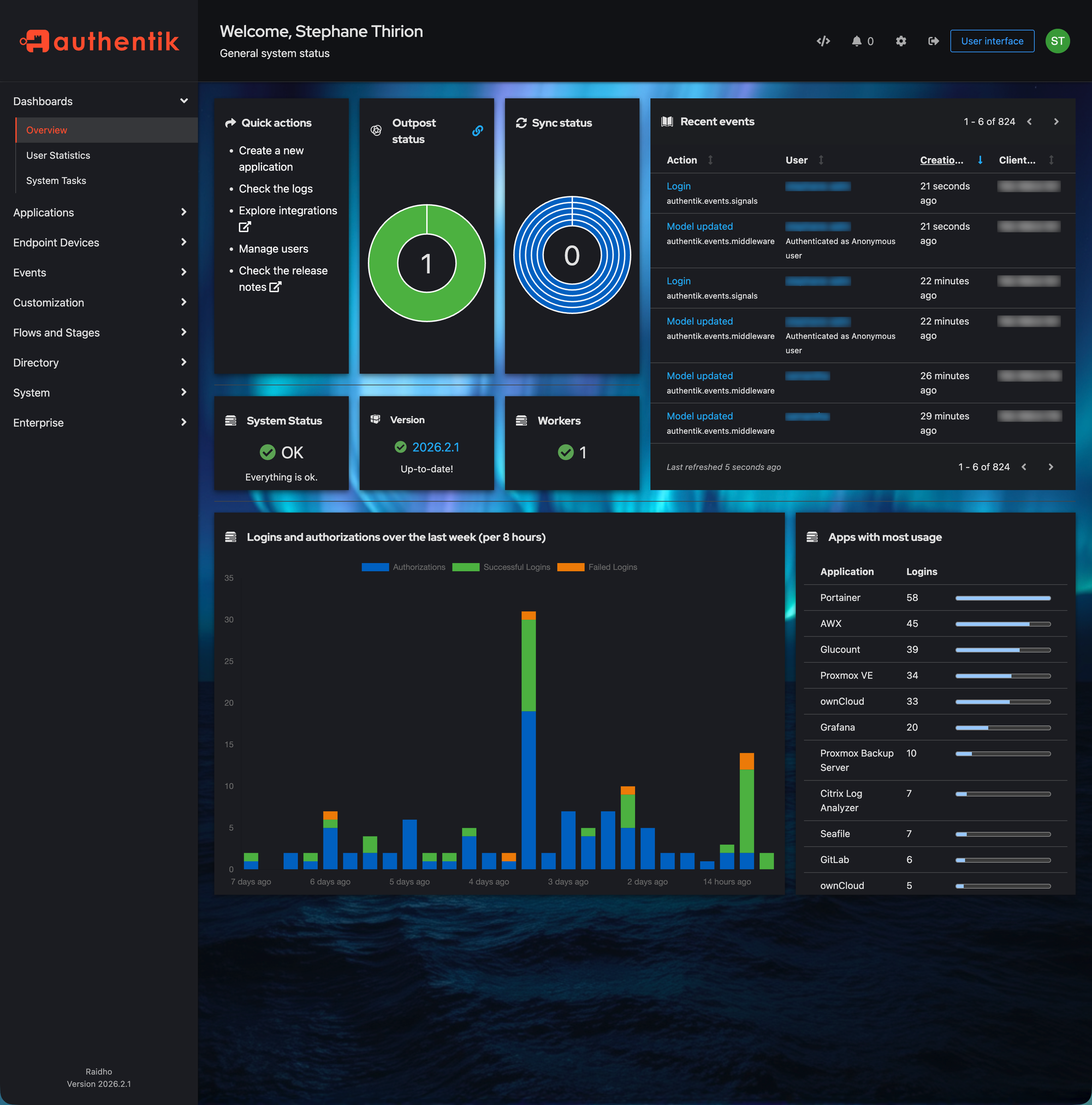
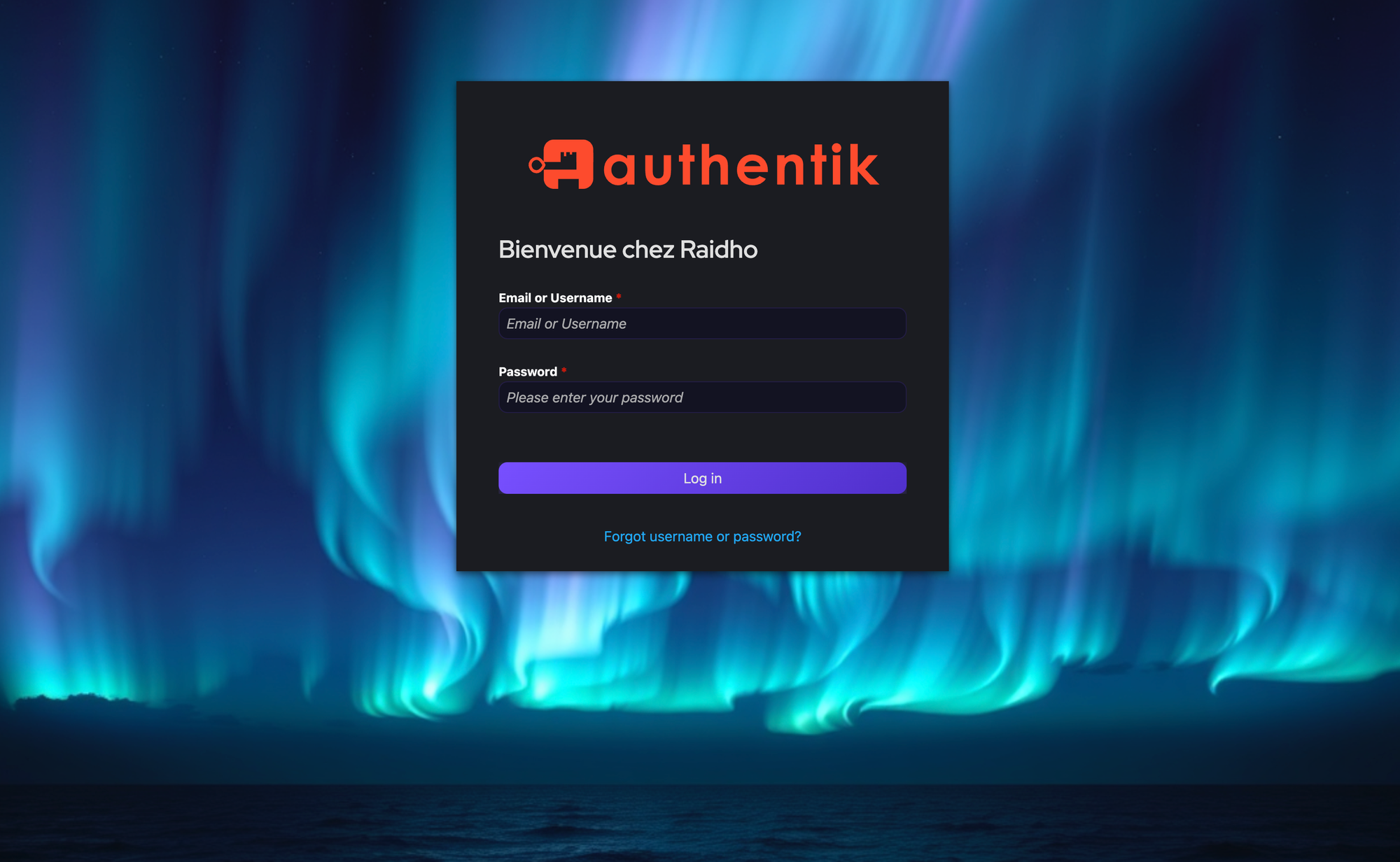
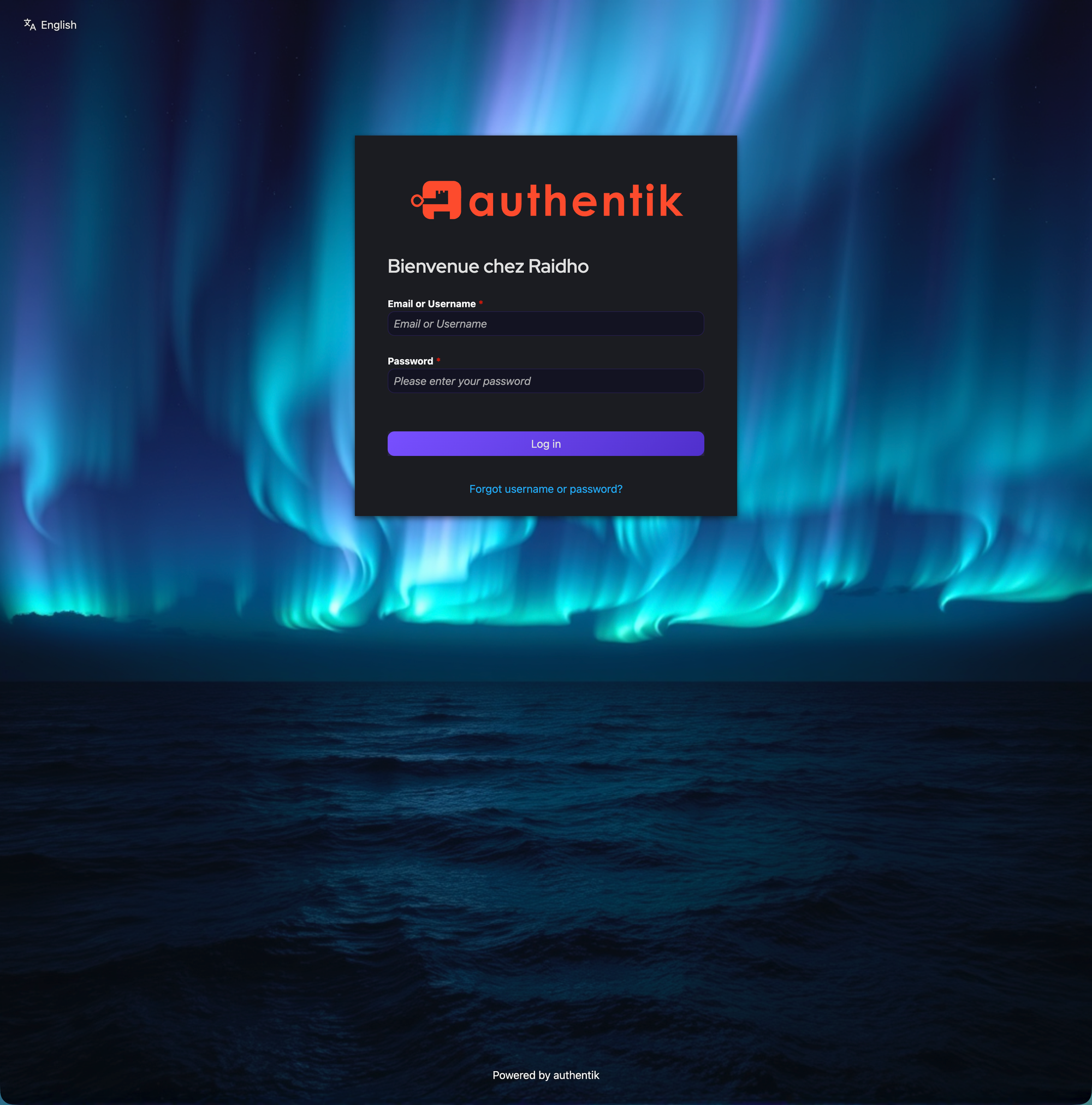
If you're already using Authentik and feeling stuck in its bland default UI, a custom theme can inject neon vibes into every login and app-catalog page. Here's how.
Generate a Background with AI
I used FLUX.1-schnell in ComfyUI with this prompt:
dark futuristic abstract background wallpaper, deep midnight blue
and electric purple gradient, subtle geometric network lines
connecting glowing cyan nodes, soft bokeh light particles,
cinematic, ultra wide 4k, no text no watermark no people
Settings: 1920x1080, 4 steps, CFG 1.0, euler sampler, simple scheduler. Then upload the result to any static host or CDN you like.
The CSS Theme
Paste this into Authentik Admin > System > Brands > Custom CSS, replacing YOUR_BACKGROUND_URL:
@import url('https://fonts.googleapis.com/css2?family=Inter');
body { font-family: 'Inter', sans-serif !important; }

.pf-c-page, .pf-v6-c-page {
    background-image: url('YOUR_BACKGROUND_URL') !important;
    background-size: cover !important;
    background-position: center !important;
    background-attachment: fixed !important;
}
.pf-c-page__main-section { background: transparent !important; }

.ak-library-application {
    background: linear-gradient(145deg,
      rgba(25,18,55,0.7), rgba(12,10,28,0.85)) !important;
    backdrop-filter: blur(16px) !important;
    border: 1px solid rgba(120,80,255,0.12) !important;
    border-radius: 20px !important;
    transition: all 0.4s cubic-bezier(0.4,0,0.2,1) !important;
    box-shadow: 0 4px 24px rgba(0,0,0,0.4) !important;
    position: relative !important;
}
.ak-library-application::before {
    content: ''; position: absolute;
    top: 0; left: 20%; right: 20%; height: 1px;
    background: linear-gradient(90deg,
      transparent, #a080ff, transparent);
    opacity: 0.4; transition: all 0.4s ease;
}
.ak-library-application:hover {
    border-color: rgba(120,80,255,0.4) !important;
    box-shadow: 0 12px 50px rgba(120,80,255,0.12) !important;
    transform: translateY(-6px) scale(1.02) !important;
}

.pf-c-button.pf-m-primary {
    background: linear-gradient(135deg, #7850ff, #5030cc) !important;
    border: none !important; border-radius: 10px !important;
}

.pf-c-form-control {
    background: rgba(15,12,35,0.6) !important;
    border: 1px solid rgba(120,80,255,0.15) !important;
    border-radius: 10px !important; color: #e8e2ff !important;
}

.ak-flow-body .pf-c-login__main {
    background: rgba(12,10,25,0.75) !important;
    backdrop-filter: blur(20px) !important;
    border-radius: 24px !important;
}
Full theme with all options in the GitLab repo.
Gotchas
Here are three hard-earned lessons:
- Don't style
.pf-c-card- it screws up Authentik's internal SVG icons. PatternFly uses Shadow DOM, and overriding card styles wrecks icon rendering. - Don't add borders to
.pf-c-modal-box- same Shadow DOM issue. Background and border-radius are safe. - Font Awesome
fa://icons are dead in Authentik 2025.10+ - they don't render. Use CDN SVG URLs instead.
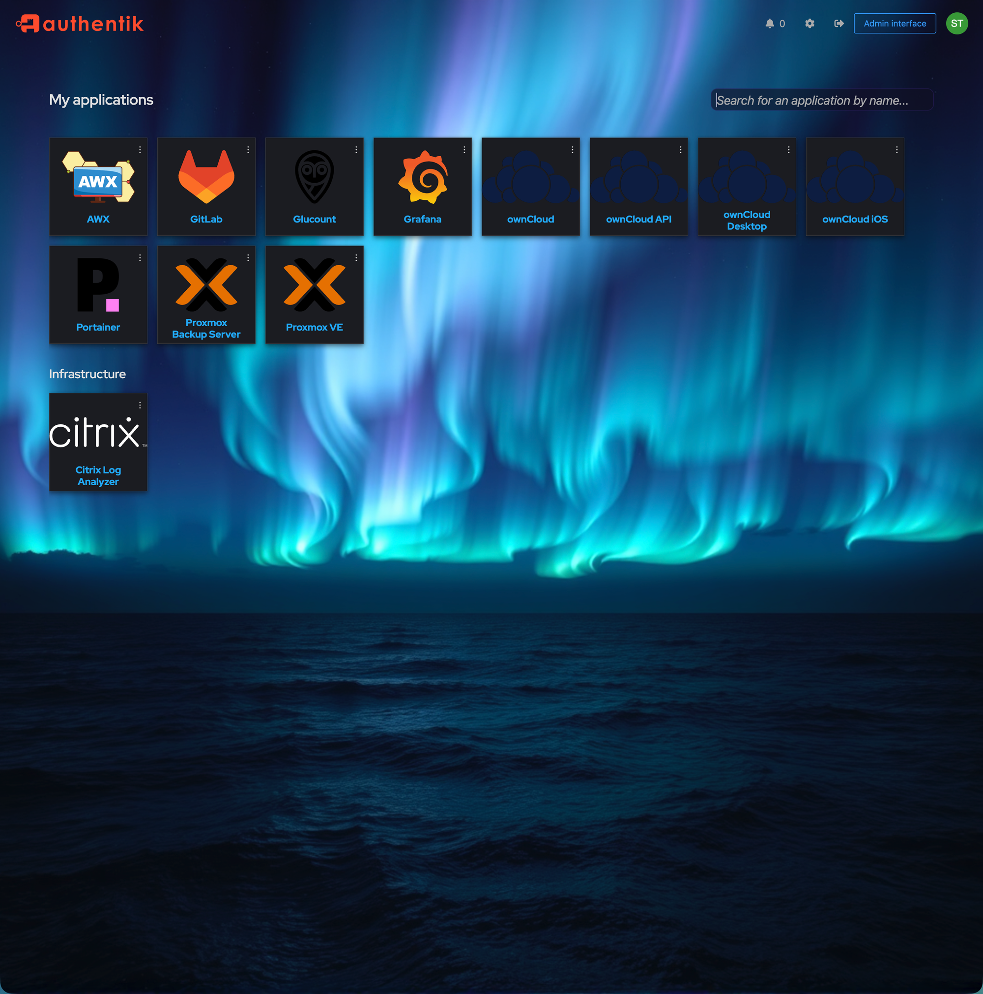
App Icons via CDN
Since Font Awesome doesn't play, grab SVGs from the awesome dashboard-icons project. Set them in Admin > Applications > Edit > Icon URL:
https://cdn.jsdelivr.net/gh/walkxcode/dashboard-icons/svg/grafana.svg
https://cdn.jsdelivr.net/gh/walkxcode/dashboard-icons/svg/gitlab.svg
https://cdn.jsdelivr.net/gh/walkxcode/dashboard-icons/svg/proxmox.svg
https://cdn.jsdelivr.net/gh/walkxcode/dashboard-icons/svg/portainer.svg
Browse all icons at github.com/walkxcode/dashboard-icons.
Compatibility
- Authentik 2025.10+ and 2026.x
- PatternFly v5 and v6
- Desktop and mobile
- Docker, Kubernetes, bare metal
Get the Theme
The full theme (CSS, AI prompt, icon list) is available on GitLab - authentik-neon. MIT licensed.
Happy hacking, and may your Authentik glow like a cyberpunk skyline!